If you joined us for the webinar on Setting Up Your Cycling Computer, check out this thread to see what Coach @trevor likes to use on his Garmin, thanks to the Garmin Connect IQ Apps.
Please share any of your own, and we can come away with some great options to optimize those screen layouts!
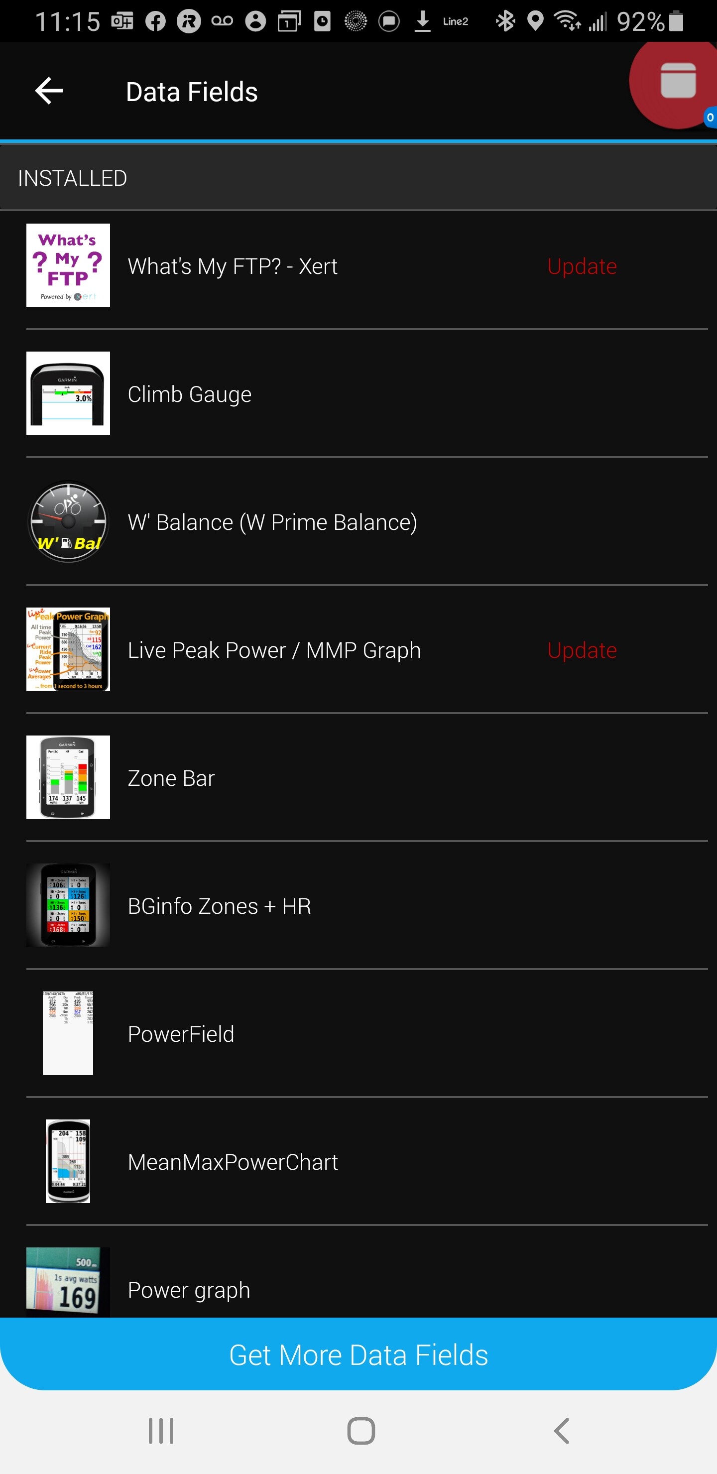
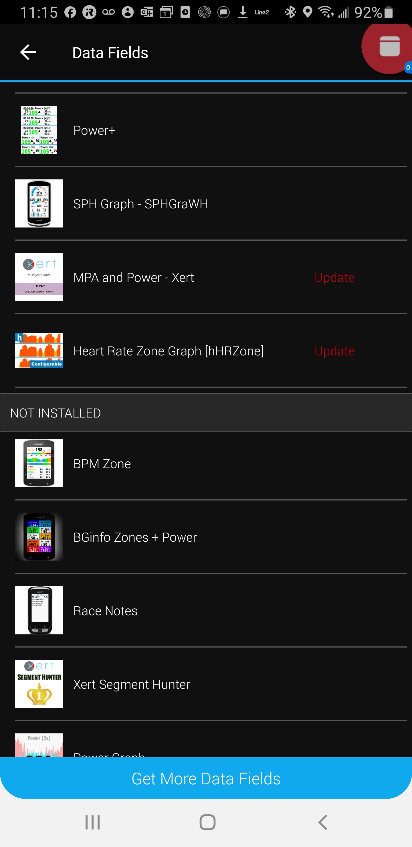
Thanks for the reminder Ryan! I’ve attached screen shots of the apps I’ve installed on computer. I use a Garmin 1030 and also have a Garmin Fenix 5X watch. All of the apps work on the 1030 and a lot of them work on the Fenix. Here’s my list:
Including @ryan in this one as well. Sorry to take so long. I was up in Canada for a month and I didn’t actually take my Garmin 1030. I was using my watch and frankly Zwift most of the time to record. So had to wait until I got back.
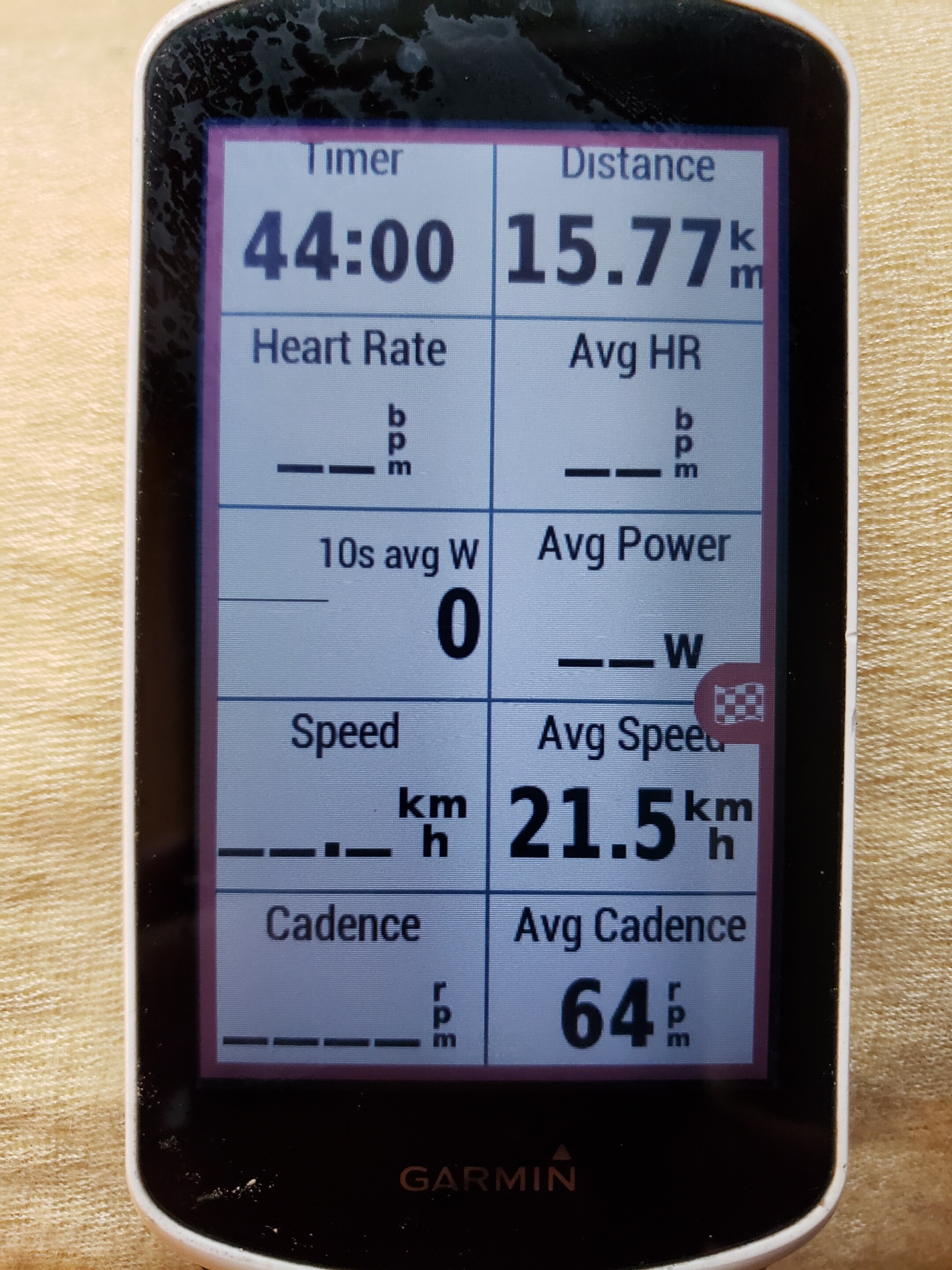
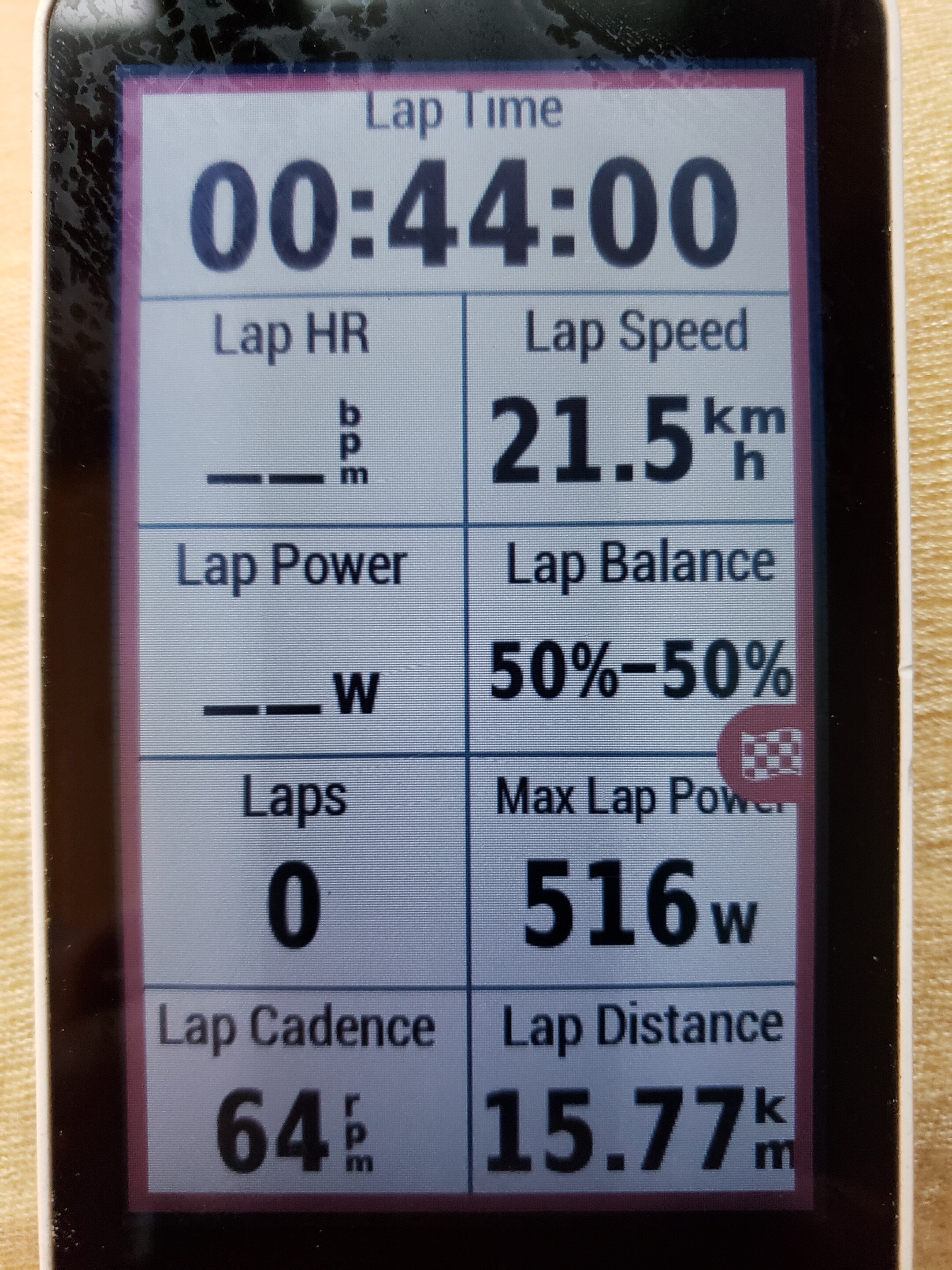
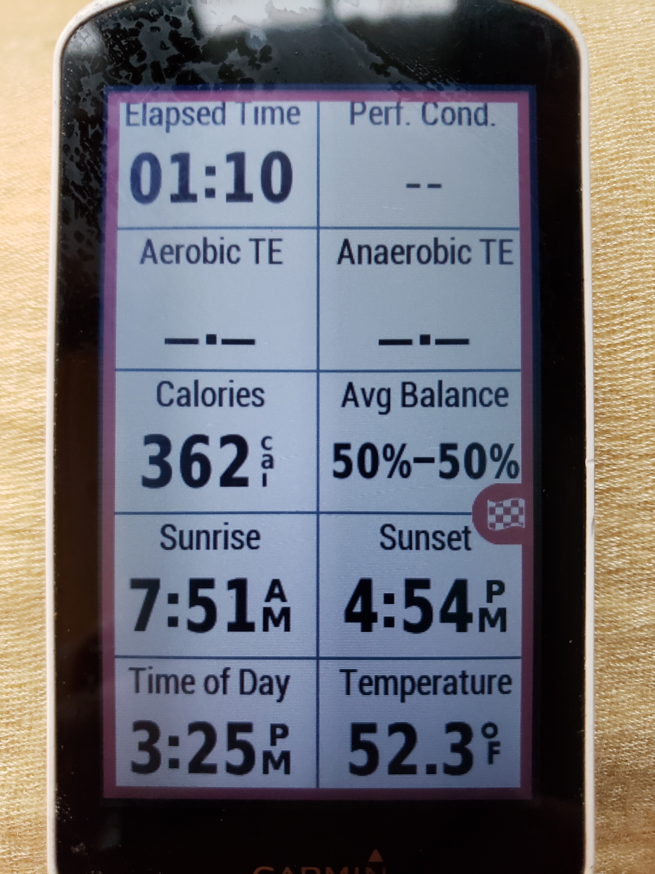
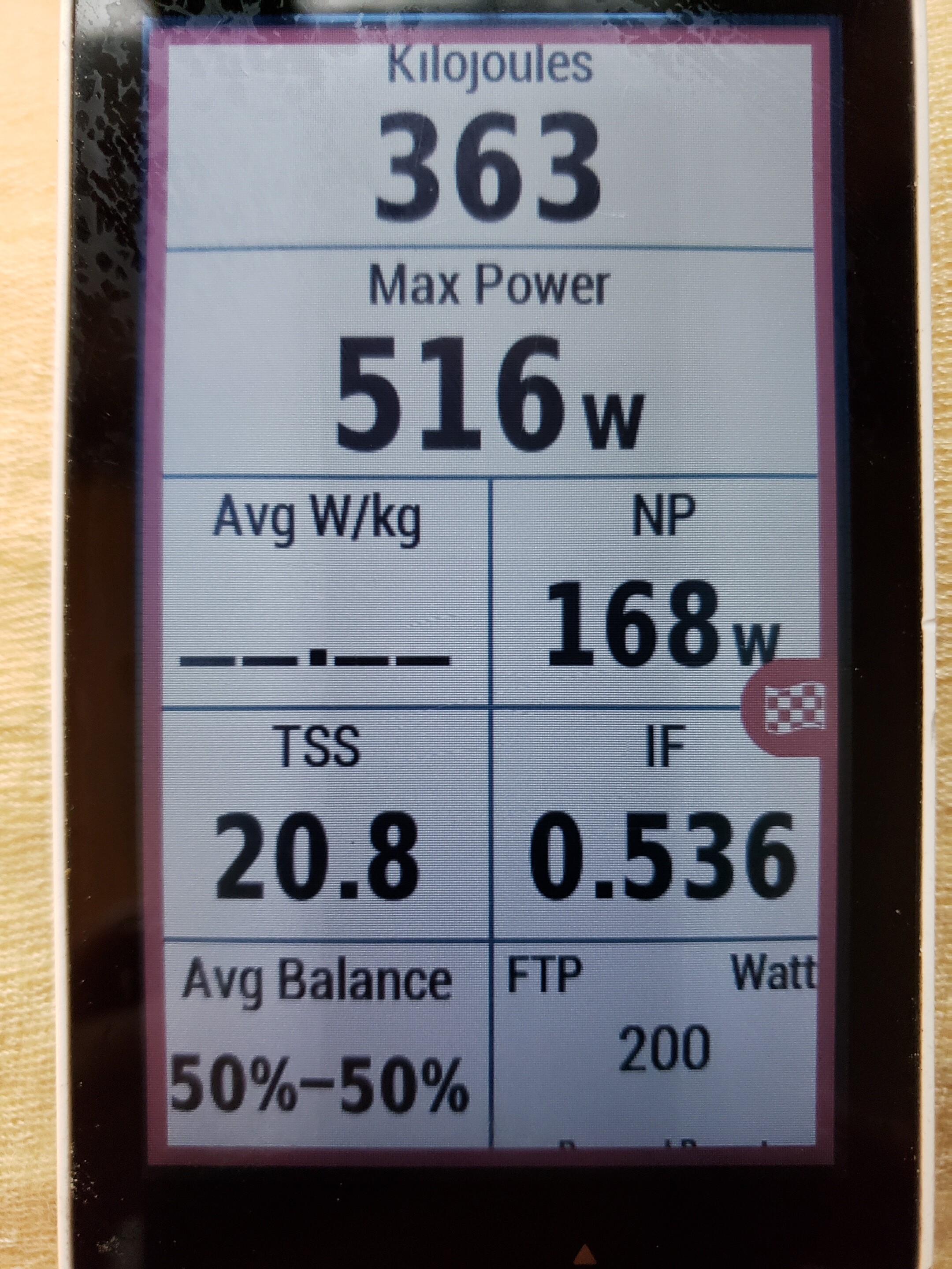
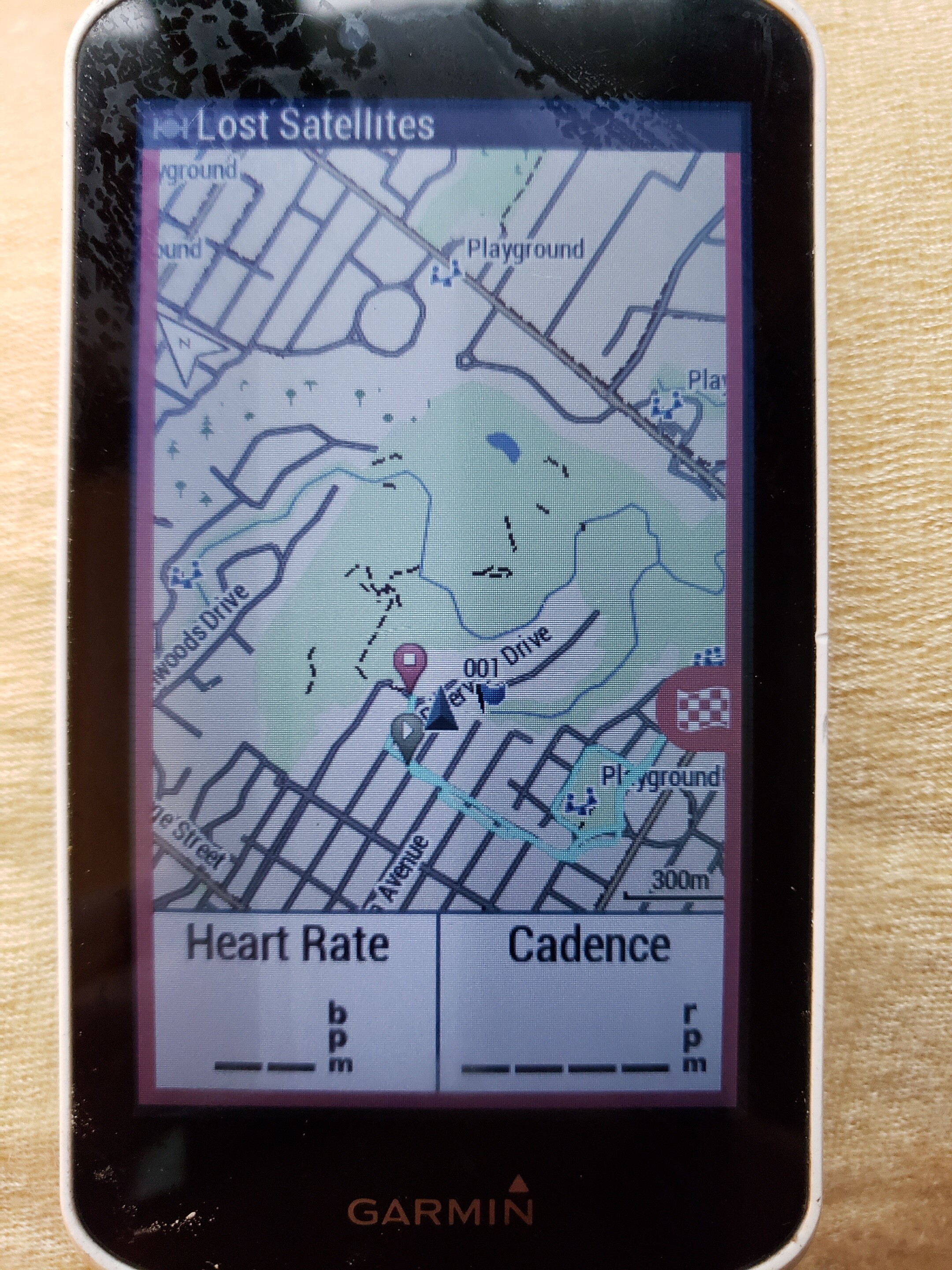
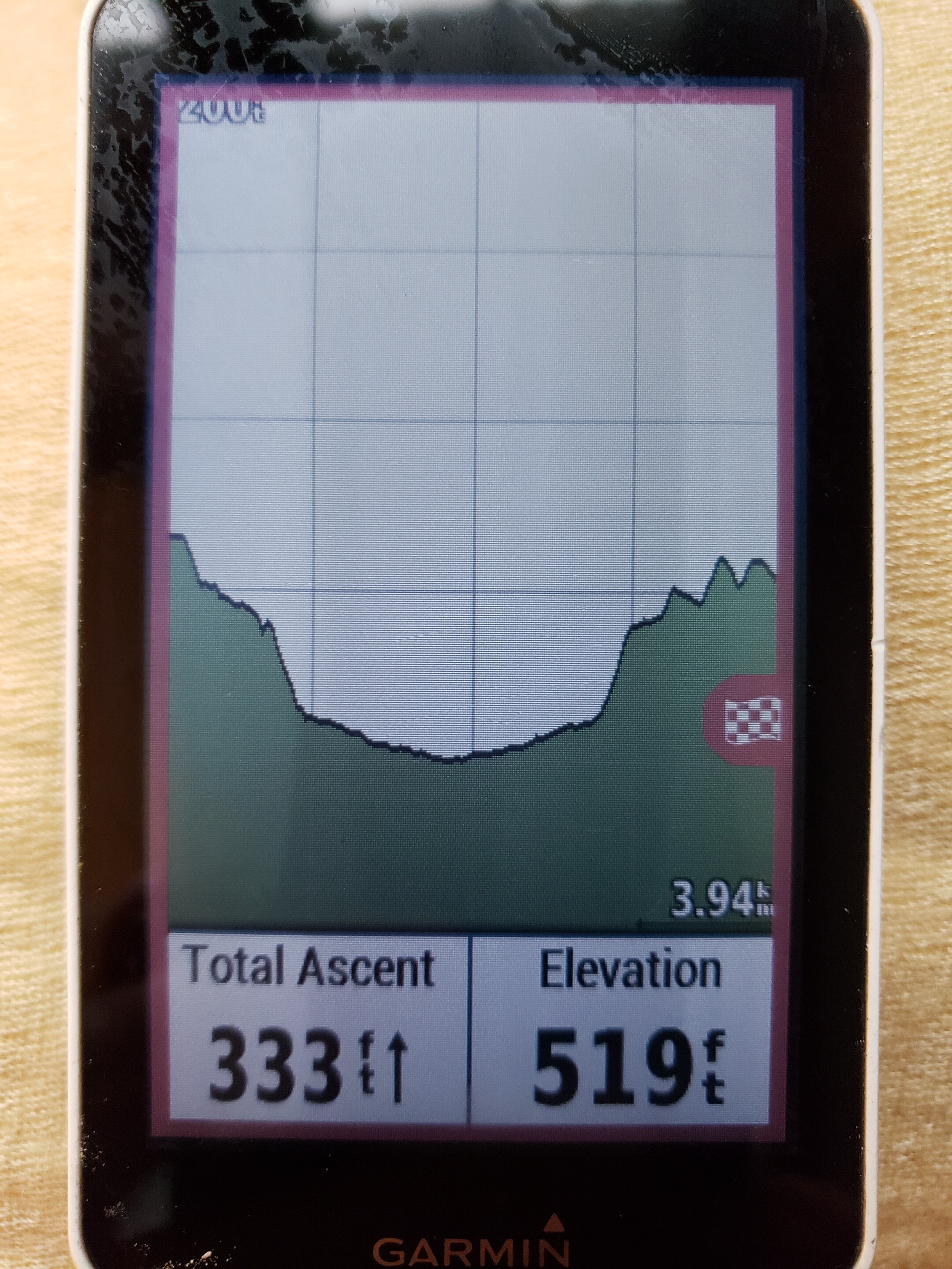
Here are all of the screens I use on my main profile. I started with my “home screen.” Then they are in order if you scroll right. i’ll point out a couple of the key things to notice:
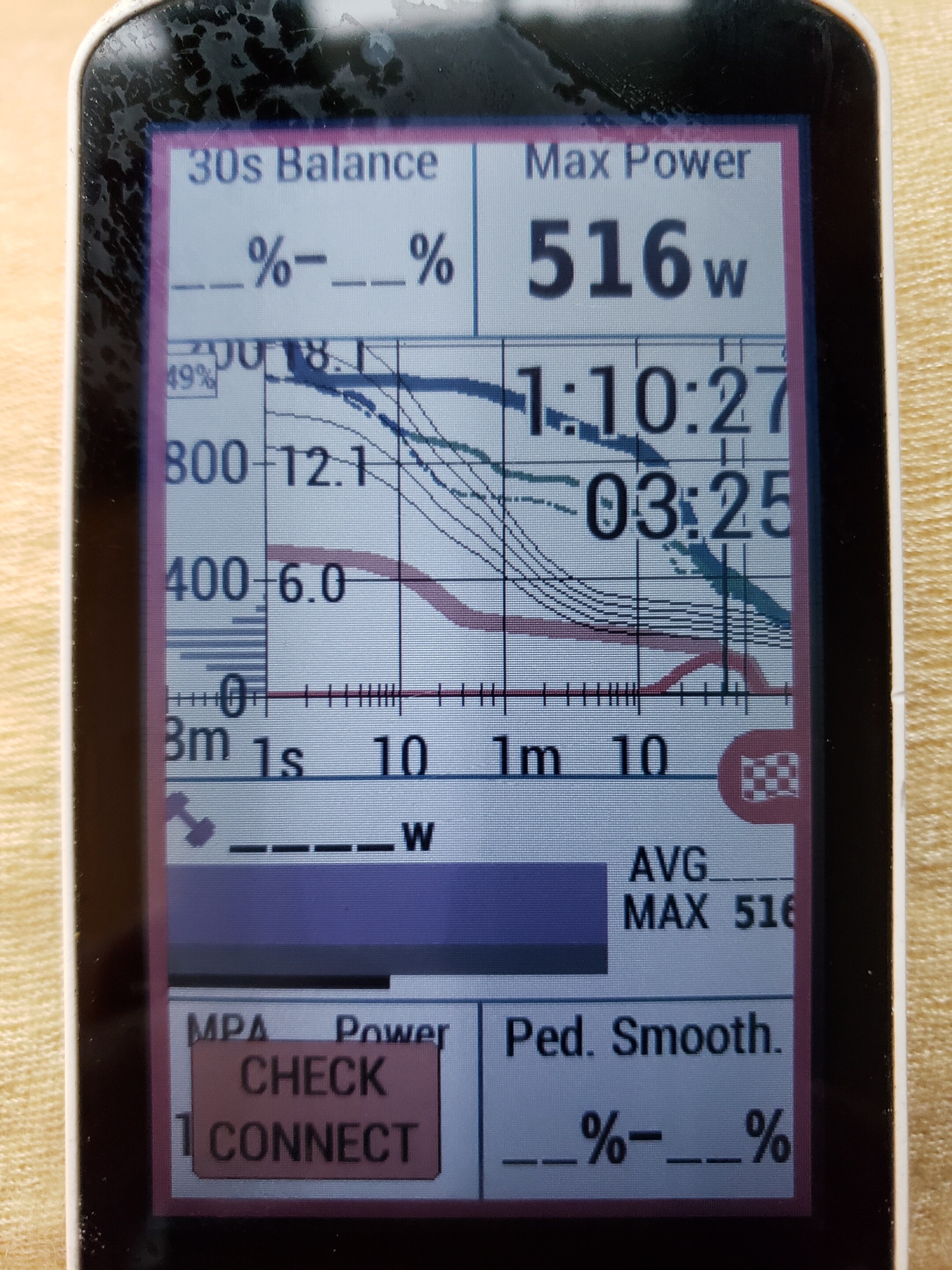
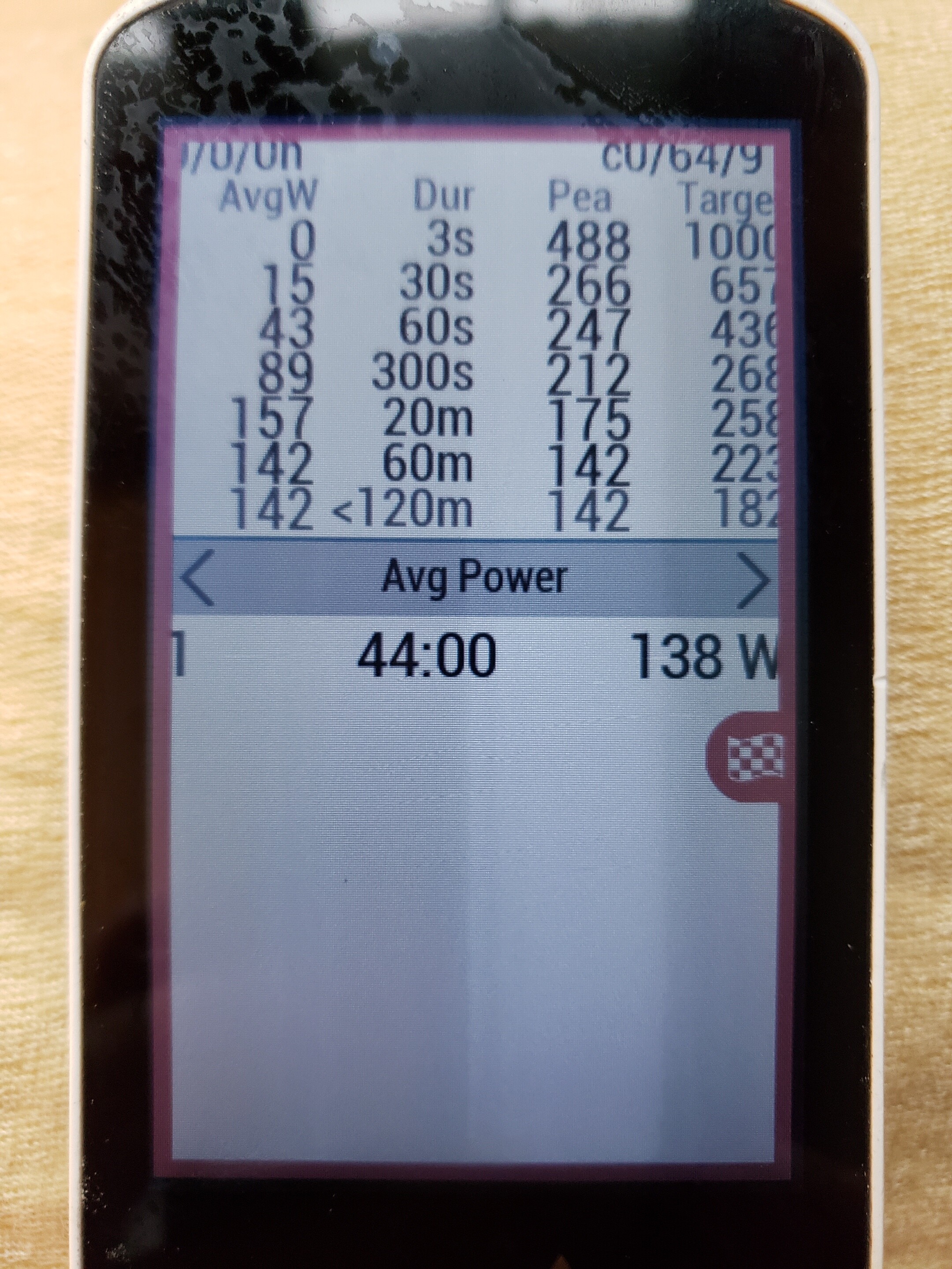
Live Power data:
I really like this screen. It shows a live power-duration curve and also a few key metrics about my pedaling. I was also using Xert’s MPA field, but it as expired:
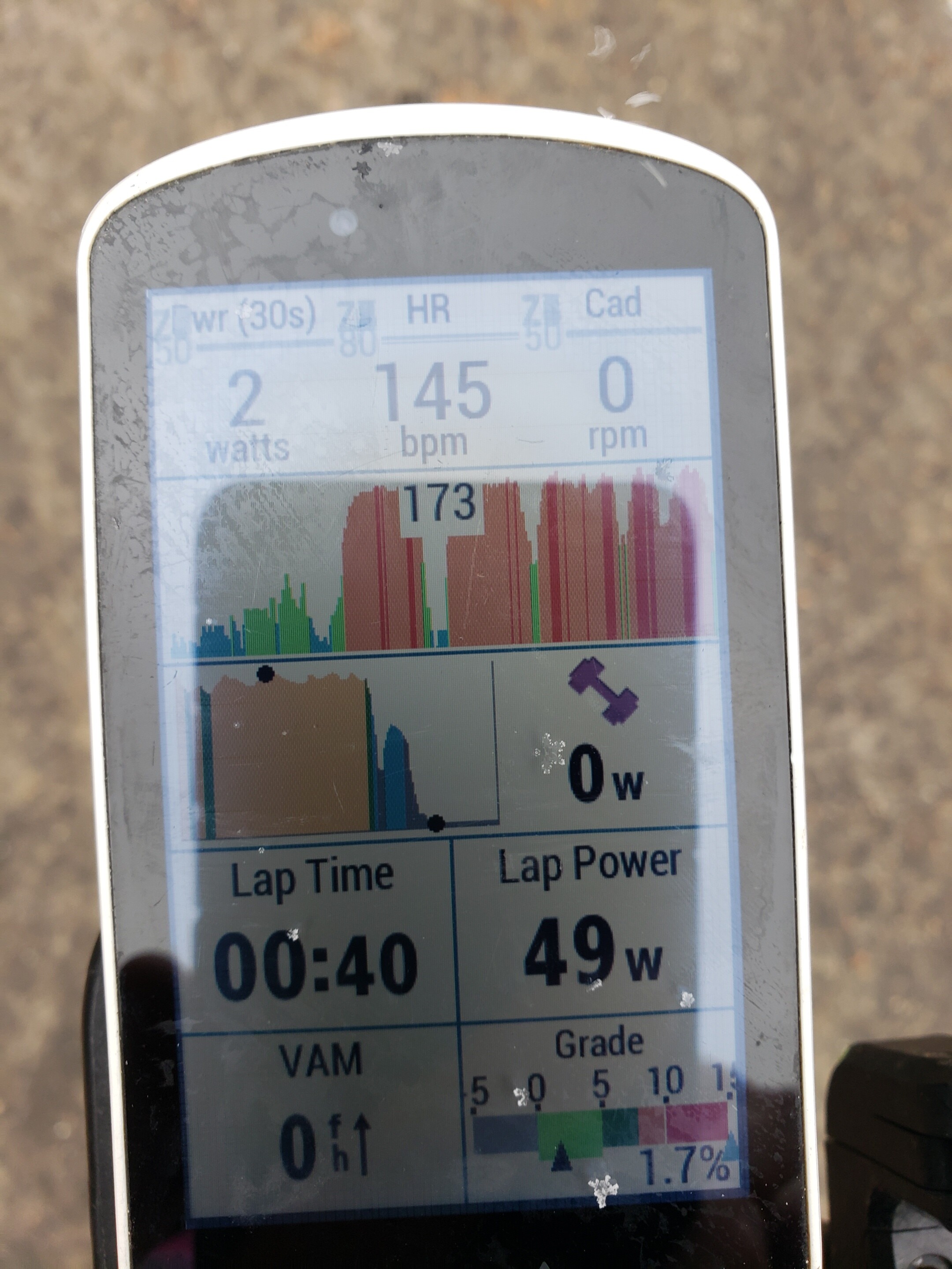
My Most Commonly Used Screen
This is my workout screen. Sorry the photo is so bad. Notice a few things:
top row is the three key metrics I want to watch while working out
below that I have heatmaps for both heart rate and power - great to see the steadiness of interval work
on the heart rate graph, it shows my max heart rate that I achieved for the displayed period. This helps me for workouts where I give myself a heart rate I can’t exceed
notice that the power reading at the top left has a 30s average while the power reading by the graph does 10s averaging
the bottom left field I change a lot depending on the workout
Hope that helps! I’m sure the screens can be improved on, but they’ve worked pretty well for me. You’ll have to let me know how you end up setting up your screens.