Bonus nerdery:
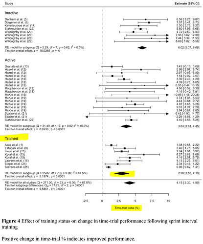
The way to read this forest plot is that the dots and lines represent individual study findings (means & ranges of outcomes). The diamonds represent the cumulative results from all studies in each subgroup, and the diamond at the bottom captures all studies. So the highlighted diamond captures the findings from all papers with trained subjects.
The X-axis is the percent (%) change in TT performance. The vertical dashed line is at 0% change in TT performance. If the diamond (or individual study lines) crosses the vertical zero-line, it indicates non-significant findings (change in TT performance could be due to chance). The width of the lines and diamonds indicates the variability in outcomes between individual subjects.
So there is a larger positive effect from SIT on TT performance in untrained subjects (6.02%) vs active (3.63%) or trained subjects (2.98%), with a lot of between-subjects variability that is not explained by training status.
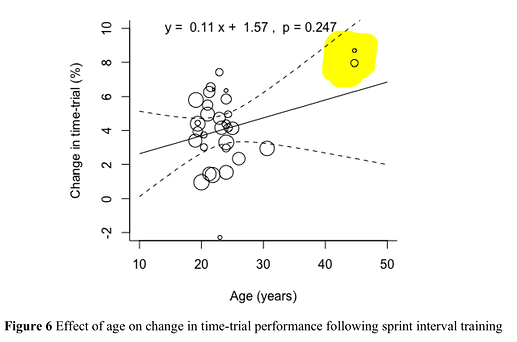
This is a linear meta-regression… fancy way of asking the question: “as x-value (age) goes up, which direction does y-value (% change TT) tend to go?”. In this case, for increasing age, % change in TT performance goes up. Each bubble represents a study mean % change in TT. The highlighted studies as mentioned have mean age > 40 yrs. Solid line is the trendline, dashed lines are the expected variability (range of expected outcomes).
Equation at the top can be used to predict % TT change. So for every +1 yr of age, a 0.11% additional positive change in TT performance is expected (+1% per 10 yrs age).
The two highlighted studies have an outsized influence on the slope of the trendline since they are so far to the right of all the other studies (bubbles). Take them out and the trendline would probably be flatter (less or no difference in % TT change with age). So maybe take this finding with a grain of salt. Also, as mentioned, the two highlighted studies are in untrained subjects, so a larger effect might be expected (as per above forest plot). Additional studies with trained subjects > 40 yrs might show around the same outcome on the y-axis as with younger subjects.
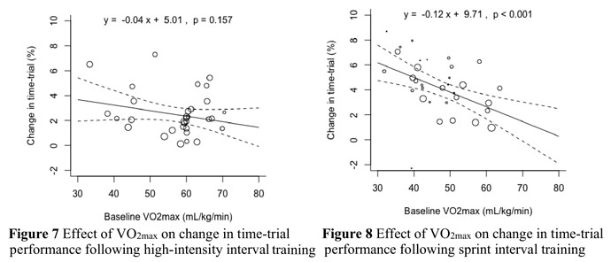
More meta-regressions for VO2max (fitness) on TT performance for both HIIT and SIT. For every +1 ml/min/kg higher VO2max, %TT performance is expected to improve by 0.04% LESS following HIIT, and 0.12% LESS following SIT. i.e. TT performance typically still improves, but it improves less in athletes with higher VO2max following HIIT. And EVEN LESS following SIT.
But another way to describe this is to say that subjects with lower VO2max may tend to see greater improvements in TT performance by following SIT compared to HIIT. The trendline is higher at low x-values for SIT, than for HIIT.
I like to visualise data like this to think about where an athlete lies across multiple dimensions of age, fitness, training status, sex, etc. to predict how they might respond to an intervention. And especially to appreciate the variability I should expect in their response. Then to re-calibrate things if and when they drift outside of that expectation.


